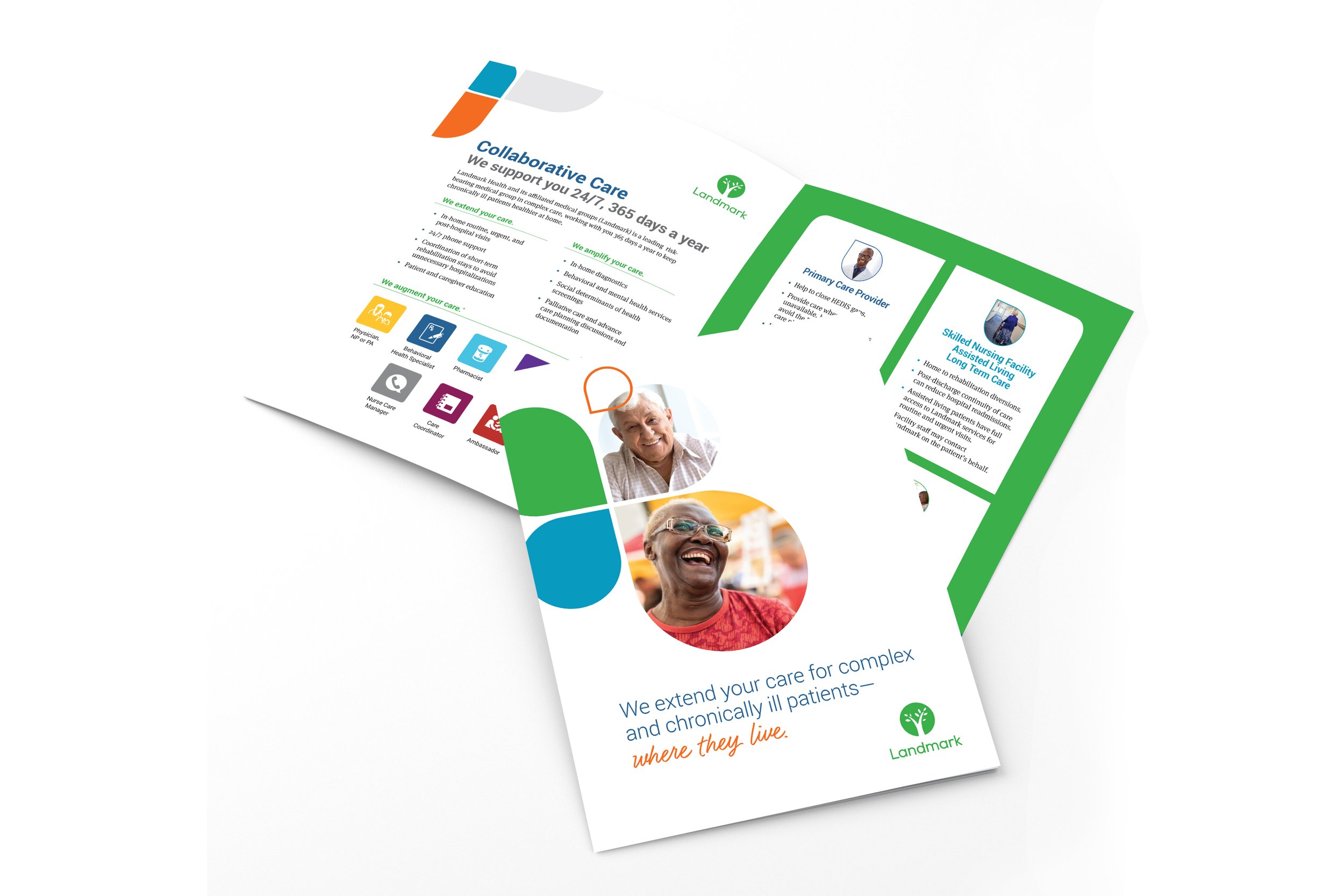
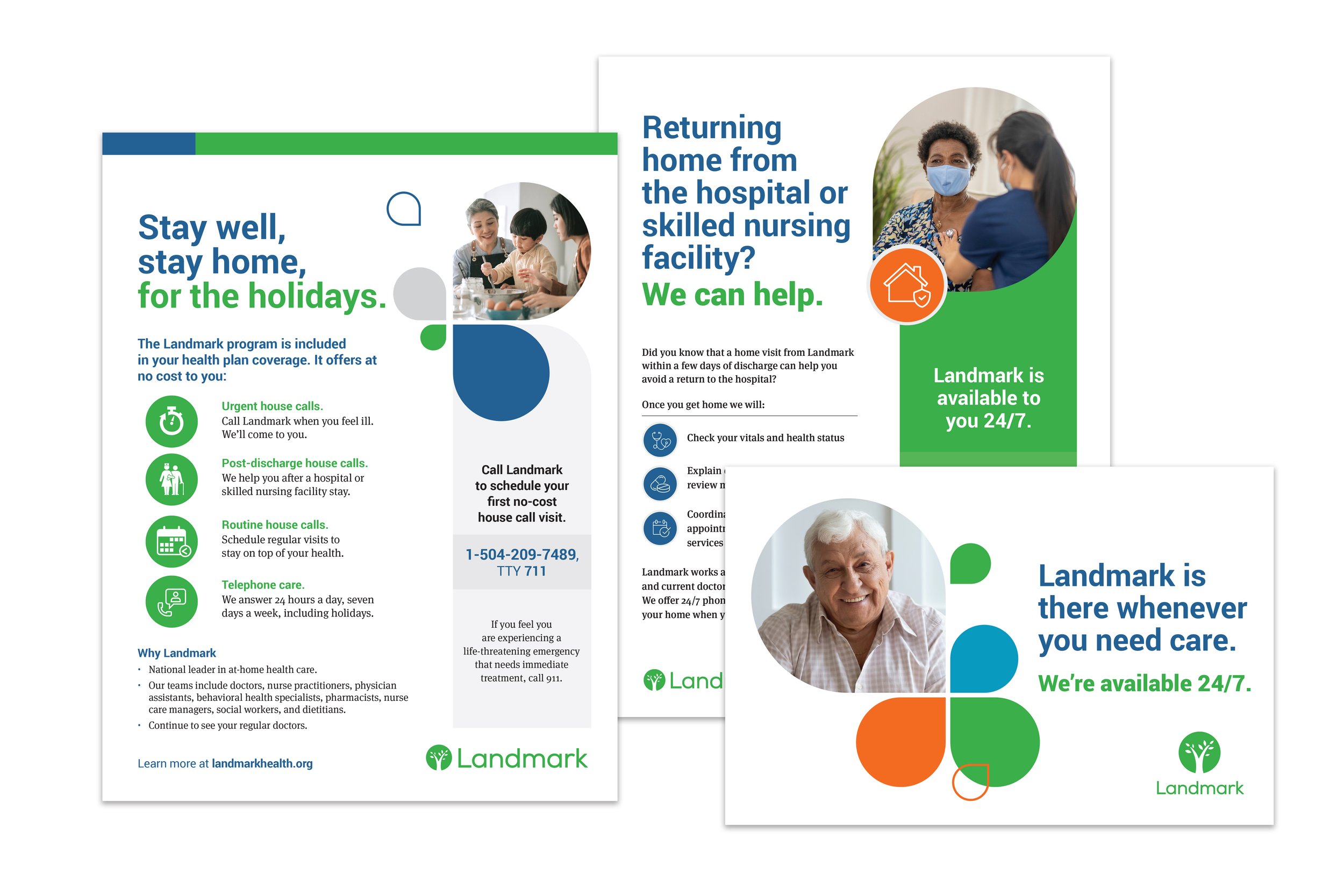
Landmark Health
Landmark Health was formed in 2007 to solve a large problem in the health care system, patients with multiple health conditions using the hospital emergency room as their primary source of health care. Landmark wanted the rebrand to be clean and more cheerful. We simplified the logo by reducing it to one color and smoothing out the tree. This gave the logo a more friendly and approachable feel. The new soft edges and different sizes of the leaves symbolizes growth. While the main color is a bright Landmark green, we created a cheerful secondary color palette to compliment. We lightened everything and put the focus on patients. The playful droplet shapes keep the feeling friendly and can be used as color elements or images.
*Brochure won a design award in the 2019 Graphic Design USA Health and Wellness design competition.